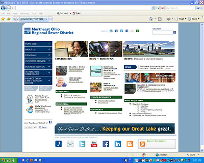
NEWS: New homepage focused on simplicity, sharing
Posted by Jared Shepherd
- 3834 Views
- October 27th, 2011
- in Miscellaneous
- No Comments
Less scrolling, less searching, more sharing.
That was the goal behind our recent neorsd.org homepage makeover, an in-house project to simplify our homepage content, better categorize our most popular pages, and promote the social resources our customers have come to appreciate.
Customers and vendors are the site’s most frequent visitors, and some of the most popular pages—jobs and careers, billing information, and project opportunities—were not prominently displayed. The new design puts aligns the highest-ranked content into three search categories: Customers, Bids and Business, and News.
Our navigation bar now includes expandable drop-downs so visitors can preview the related page links without leaving the homepage. There also are fewer nav buttons, as well, with more accurate tab titles for easier navigation.
The new page header features sharing widgets to help visitors easily promote content, such as cost-saving program opportunities or job postings, and all of our social sites such as Facebook, Twitter and YouTube are collected cleanly in the homepage footer.
